Using neutral colours

With an almost infinite range of colours from pure white to earthy tones of grey and beige, neutrals are timelessly fashionable. By Katherine Sorrel
Experts agree that you should always paint walls a neutral colour. Unless a potential buyer shares your exact taste, they will be put off by rooms painted in vibrant colours. But what if you’re building or renovating a home that you plan to stay in? Aren’t neutrals just a little boring?
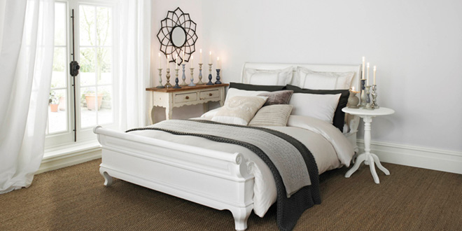
Only when you get it wrong. A well-planned neutral scheme is good-looking yet understated, harmonious, calm and inviting. Neutrals work well in both old and new houses, small or large spaces and are brilliant at providing cohesion between rooms.
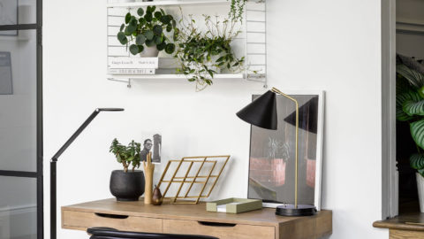
Let’s start with white. Rooms painted pure white can appear bigger and brighter, thanks to the way the colour reflects light around. A clean white wall is a great background for vibrant paintings, for the coloured spines of books, or simply for a jug of flowers. On the other hand, though, white can appear cold, stark and unwelcoming, especially when a room is north- or east-facing and doesn’t have the benefit of direct sunlight. A white with an added touch of yellow or pink can warm up such a space. White can also look odd in period homes. Slightly muddier off-whites are often a better choice for an old cottage, Georgian terrace or a barn conversion. The lesson is to use pure white with care. Beyond white, neutrals vary in hue from cream to sand, through beige to stone. How do you choose? The best advice is to eliminate neutrals that you don’t like and those that won’t suit the architecture of your house or colours of your furniture.
Next, paint at least two coats on a large piece of white card, or better still, on several pieces of card, and stick them on every wall around the room. Observe
the colours at different times of day and with your lights both on and off.
Having chosen your favourite colour, avoid using it everywhere. Even the nicest neutral can be boring if used indiscriminately. Be careful, however, when combining neutrals: another big mistake is to use different hues that are all of the same tone (slightly different colours but the same degree of lightness or darkness).
The solution to both these problems is to take a colour chart and go up or down (dark to light) within the same colour family, rather than working across from colour to colour. Use darker tones for woodwork, with lighter ones for walls or, if you have features such as cornices and dadoes, you may wish to vary the wall tones with lighter ones above and darker ones below the divisions. You can also use different neutrals to provide a gentle visual link from room to room.
Finally, bear in mind that the plainer the colours, the more important texture becomes, so choose your finishes with as much care as you do your colours. The shinier the finish, the paler the colour will appear, so you may need to compensate by choosing a slightly darker shade.
The results should be stylish and easy to live with, as well as adding value to your property. Now who said neutrals were boring?


